Customizing Theme for SDK & Hosted
Partners can personalize the look and feel of their WebSDK integration using a JSON configuration file. Each app ID requires its own config file that includes both system-level and partner-specific settings.
{
"name": "Cardlytics Rewards",
"theme": {
"colors": {
"gradientA": "#2196F3",
"gradientB": "#1E59AF",
"negative": "#E91B0C",
"positive": "#27AE60",
"primary": "#006AC3",
"warning": "#EC9235"
},
"fonts": {
"body": [
{
"url": "https://cdn.prod.website-files.com/64dbb284e8fd858cb428eb8a/64dbb284e8fd858cb428ebc6_CircularStd-Book.woff",
"weight": "450"
},
{
"url": "https://cdn.prod.website-files.com/64dbb284e8fd858cb428eb8a/64dbb284e8fd858cb428ebd1_CircularStd-Medium.woff",
"weight": "500"
},
{
"url": "https://cdn.prod.website-files.com/64dbb284e8fd858cb428eb8a/64dbb284e8fd858cb428ebc5_CircularStd-Bold.woff",
"weight": "700"
}
],
"headline": [
{
"url": "https://cdn.prod.website-files.com/64dbb284e8fd858cb428eb8a/64dbb284e8fd858cb428ebc5_CircularStd-Bold.woff",
"weight": "700"
}
]
}
}
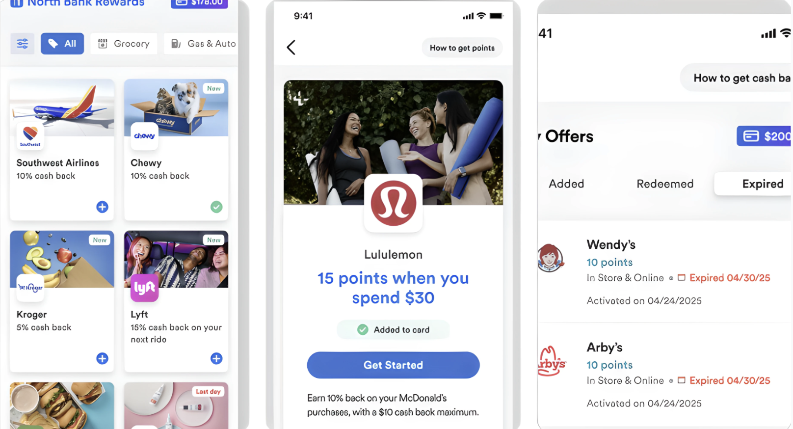
}What Can Be Customized?
1. Program Name
- Display name shown across the UI
- Example:
North Bank Rewards
2. Colors
Customize your integration’s color palette to align with your brand:
-
Primary Color
Used for titles, buttons, and text
Example: Primary blue shown in the screenshots -
Gradient Colors
Used in large call-to-action buttons (e.g.,$200.00)
Format: Two HEX values
Example:["#123456", "#abcdef"] -
Semantic Colors
Success: For checkmark icons or confirmationsError: For expired statuses or errorsWarning: Reserved for future use (optional)
3. Font Family
You may provide your own font files to match your brand’s typography:
- Supported font weights:
450,500,700 - Accepted formats:
.woff,.ttf, etc. - Fonts will be hosted on our system
- If not provided, browser default
sans-serifwill be used
4. Partner Icon
- Upload a raw image (recommended:
SVGorPNG) - This will be used as your branded icon in the UI
- We will host the image
5. Screenshots for Reference
6. Submission
- Prepare a JSON config per app ID using the sample structure.
- Include all assets (fonts, icon) if applicable.
- Submit the JSON and assets to your integration manager.
Updated 11 months ago
Did this page help you?